Humber Music
50th Anniversary
50th Anniversary
branding, layout design, typography, illustration, web design
The Brief:
Humber was celebrating the 50th anniversary of their music program and required a logo and a 24 page booklet that would be printed and hosted online on a microsite as a flipping book.
My Role:
I was responsible for the creation of the logo and the design and layout of the booklet.
The How:
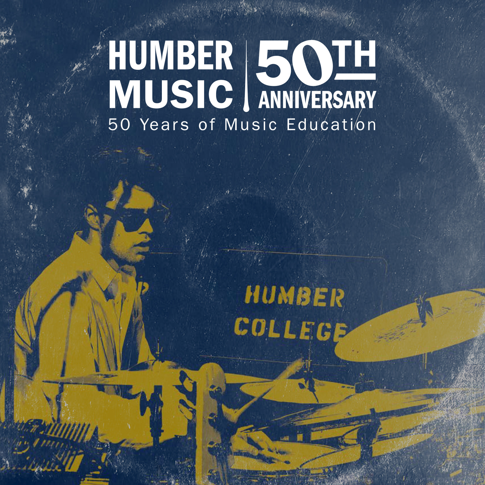
Logo: To separate the different types of information within the logo I played with varying font styles. To continue to separate information and communicate the music theme I created a conductor's baton to divide Humber Music from 50th Anniversary. To further communicate the music theme I played with the counter of the 0 in 50th to resemble a whole note and tilted it to the left.
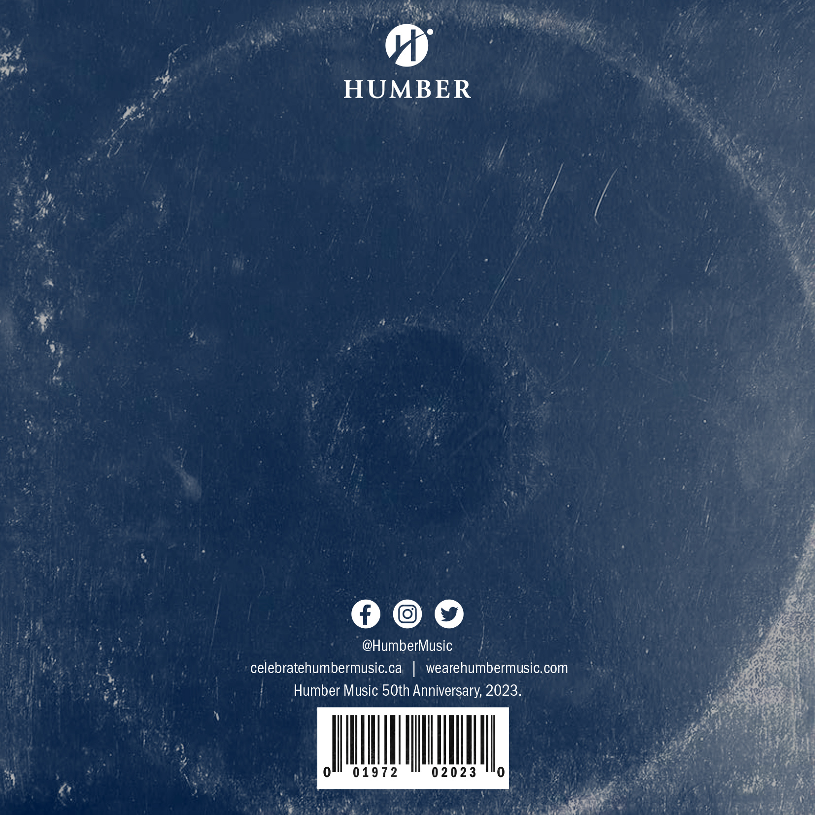
Brochure: I noticed that the brochure was in a 1x1 ratio and that this was similar to a record sleeve. To create this record sleeve aesthetic I chose to stylize a supplied photo from Humber in the Humber blue and gold. I then overlaid a record sleeve texture that gave the impression there was a record inside. To further communicate the record concept the back of the brochure was laid out similar to an actual record, including a faux bar code.


